I think the current profile page looks too bland, so Im giving it a revamp! Still working on it, so any feedback appreciated!
Ty to my friend Anton for helping me
before:

after:
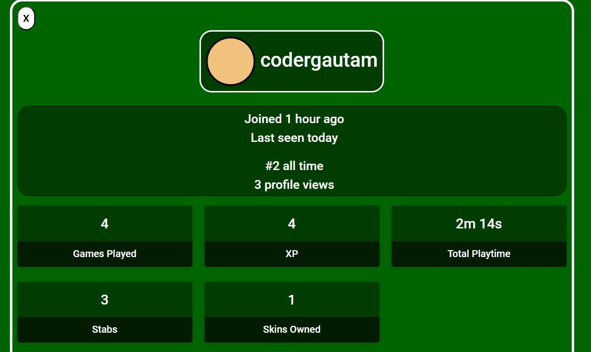
I think the current profile page looks too bland, so Im giving it a revamp! Still working on it, so any feedback appreciated!
Ty to my friend Anton for helping me
before:
after:
I think the margin(?) a bit wider for the white border. It’s too close to the boxes. Not sure if I’m clear enough, I’ll be happy to clarify if needed.
Does it have to be default skin?
Make the bottom two boxes centered. No symmetry bother me
I really hope it’s the skin that the player last equipped, that would be cool.
The X button looks weird make it a circle TwT
skin next to the name could be the skin the person wore/is wearing most recently. also close button is a bit stretched and yea increase white border of the div
Make the white outlines thicker and bright lime instead (to match the green color scheme), make the x button a circle and then just take the stupid coins stat and put it in that blank spot because then it isn’t uneven

This is how I would personally design the profile page, but this is only my personal preference.
That layout definitely is better but I’d say do something like this (very rushed btw)

I agree with shadow and cool guy but I would switch those two

It’s the equipped skin, yes
So make it closer tothe edges more? Not sure wym
Wow that looks great, I’ll try that out
OK I will try both orders and will see what I like better.
Will add the coin count, sure
A suggestion, you should put the best game the user has had (coins and time) on the profile.
I mean honestly, theres still a lot of space on the profile on this part

I’d be down for the best game stuff, maybe other stuff that could be on there too
Much better
Sorry for the confusion. I meant having a wider gap between the boxes (game played, XP, Total Playtime) and the white border. I thought the boxes were too close to the border in the original design.
And kills